
Flutter Dropdown in AlertDialog Box and Show Dialog

GF Flutter AlertDialog and its Usage
Alert Dialog is a Flutter component that is used to inform the user about the action that has to be taken. Basically, alert is a prompt that prompts/evokes the user to take the action that has buttons and gives information that pops on the screen.
GFAlert is a Flutter Alert Dialog that shows upon clicking the relevant button that gives some kind of information or messages and it apparently has some action buttons.
GF Flutter Alert Dialog should be wrapped inside the GFFloating Widget. The child of the GFFloatingWidget takes GFAlert as its argument and the body takes any kind of widgets.
The below-added code shows how to perform alert Dialog box in a flutter. I have used GFFloatingWidget as a body and the child takes the alertWidget as its parameter.
import 'package:getwidget/getwidget.dart';

Widget alertWidget;
bool showblur = false;

Scaffold(
    appBar: AppBar(
      backgroundColor: GFColors.DARK,
      leading: InkWell(
          onTap: () {
            Navigator.pop(context);
          },
          child: Container(
            child: Icon(
              CupertinoIcons.back,
              color: GFColors.SUCCESS,
            ),
          )),
      title: const Text(
        'Animation',
        style: TextStyle(fontSize: 17),
      ),
      centerTitle: true,
    ),
    body: GFFloatingWidget(
        verticalPosition: 150,
        showBlurness: showBlur,
        child: alertWidget,
        body: Column(
          children: [
            Container(
              margin: const EdgeInsets.only(top: 20),
              color: Colors.transparent,
              child: Center(
                child: GFButton(
                    text: 'Tap to View',
                    onPressed: () {
                      setState(() {
                        showBlur = true;
                        alertWidget = GFAlert(
                          alignment: Alignment.center,
                          backgroundColor: Colors.white,
                          title: 'Welcome!',
                          content:
                          'Get Flutter is one of the largest Flutter open-source UI library for mobile or web apps with  1000+ pre-built reusable widgets.',
                          type: GFAlertType.rounded,
                          bottombar: Row(
                            mainAxisAlignment: MainAxisAlignment.end,
                            children: <Widget>[
                              GFButton(
                                onPressed: () {
                                  setState(() {
                                    alertWidget = null;
                                    showBlur = false;
                                  });
                                },
                                color: GFColors.LIGHT,
                                child: const Text(
                                  'Close',
                                  style: TextStyle(color: Colors.black),
                                ),
                              ),
                            ],
                          ),
                        );
                      });
                    }),
              ),
            ),
          ],
        )
    ),
 ),

Flutter Alert Dialog with multiple buttons
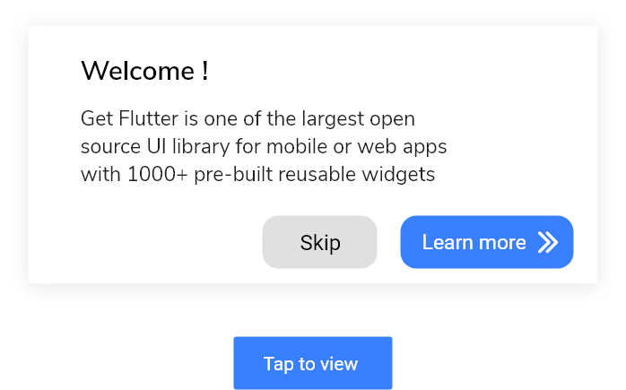
GFAlert can have two or more buttons for call of action in the bottombar of the alert widget.
The code below shows the multiple buttons Dialog Alert Button.
import 'package:getwidget/getwidget.dart';

 return Scaffold(
   body:GFFloatingWidget(
     child:GFAlert(
              title: 'Welcome !',
              content: 'Get Flutter is one of the largest Flutter open-source UI library for mobile or web apps with  1000+ pre-built reusable widgets.',
              bottombar: Row(
                 mainAxisAlignment: MainAxisAlignment.end,
                 children: <Widget>[
                  GFButton(
                      onPressed: (){
                      setState(() {
                        showalert=false;
                    });
                  },
                    shape: GFButtonShape.pills,
                     child: Text('Skip',style: TextStyle(color: Colors.black)),
                   SizedBox(
                    width:5
                    ),
                    GFButton(
                      onPressed: (){
                      setState(() {
                        showalert=false;
                    });
                  },
                    shape: GFButtonShape.pills,
                    icon: Icon(Icons.keyboard_arrow_right, color: GFColors.getGFColor(GFColor.white),),
                    position: GFPosition.end,
                    text: 'Learn More',)
                ],
              ),
            )
   body:Text('body or any kind of widget here..')
 )
)
Flutter AlertDialog Type
There are three types of alerts ie, basic , rounded and fullWidth . The default alert is a basic alert. The below code shows the rounded alert. For fullWidth alert replace rounded with fullWidth.
import 'package:getwidget/getwidget.dart';

 return Scaffold(
   body:GFFloatingWidget(
     child:GFAlert(
              title: 'Welcome !',
              content: 'Get Flutter is one of the largest Flutter open-source UI library for mobile or web apps with  1000+ pre-built reusable widgets.',
              type: GFAlertType.rounded,
              bottombar: Row(
                 mainAxisAlignment: MainAxisAlignment.end,
                 children: <Widget>[
                  GFButton(
                      onPressed: (){
                      setState(() {
                        showalert=false;
                    });
                  },
                    shape: GFButtonShape.pills,
                     child: Text('Skip',style: TextStyle(color: Colors.black)),
                   SizedBox(
                    width:5
                    ),
                    GFButton(
                      onPressed: (){
                      setState(() {
                        showalert=false;
                    });
                  },
                    shape: GFButtonShape.pills,
                    icon: Icon(Icons.keyboard_arrow_right, color: GFColors.getGFColor(GFColor.white),),
                    position: GFPosition.end,
                    text: 'Learn More',)
                ],
              ),
            )
   body:Text('body or any kind of widget here..')
 )
)
Flutter Dialog Alert Positioning
GFAlerts can be positioned accordingly inside the GFFloating Widget. The positioning takes two parameters ie, horizontalPosition and verticalPosition. The usage of these is shown below.
import 'package:getwidget/getwidget.dart';

body:GFFloatingWidget(
    horizontalPosition:40.0,
    verticalPosition:20.0,
    child:GFAlert(
    title: 'Welcome!',
  ),
 body:Text('body or any kind of widget here..')
)
GF Flutter AlertDialog Custom Properties
The look and feel of the GFAlert can be customized using the following properties
| Name | Description |
|---|---|
| child | child of type [Widget] which is alternative to title. title will get priority over child |
| contentChild | contentchild of type [Widget] which is alternative to content. content will get priority over contentchild |
| titleTextStyle | changes the style of the title not for the child |
| backgroundColor | used to change the backgroundColor of the GFAlert |
| contentTextStyle | changes the style of the content not for the contentChild |
| width | used to control the width of the Alert |
| alignment | used to align the title or content to desired position |
Last Updated: September 21, 2023

