
GF Flutter Border

GF Flutter Border is a Flutter Border that has all four sides and it makes a thin line around any widget.
GFBorder can be used as a solid border, dashed border, or dotted border for images, texts, or even buttons. Let us see all of them one by one below
GF Flutter Solid Border
GFSolid Border is a solid line and a basic and solid border used for the many components. GFBorder property [dashedLine] takes an array of doubles like[2, 0] to display a solid border.
The below example code shows a basic Flutter solid border.
Container(
  margin: EdgeInsets.symmetric(
      horizontal: 15, vertical: 15),
  child: GFBorder(
    color: Color(0xFF19CA4B),
    dashedLine: [2, 0],
    type: GFBorderType.rect,
    child: Image.asset(
      'assets image here',
      width: MediaQuery.of(context).size.width,
      fit: BoxFit.fitWidth,
    ),
  ),
),

GF Flutter Dashed Border
GFDashed Border is a customized border with dashed patterns used in UI designs. GFBorder property [dashedLine] takes an array of doubles[4, 6]to display a dashed border.
The below example code shows a dashed border in Flutter
Container(
  margin: EdgeInsets.symmetric(
      horizontal: 15, vertical: 15),
  child: GFBorder(
    dashedLine: [4, 6],
    type: GFBorderType.rect,
    color: Color(0xFF19CA4B),
    child: Image.asset(
      'assets image here',
      width: MediaQuery.of(context).size.width,
      fit: BoxFit.fitWidth,
    ),
  ),
),
GF Flutter Dotted Border
GFDotted Border is a customized border with dotted patterns used in many UI designs. GFBorder property [dashedLine] takes an array of doubles[2, 1]to display dotted border.
The below example code gives a dotted border around the image as shown below

Container(
  margin: EdgeInsets.symmetric(
      horizontal: 15, vertical: 15),
  child: GFBorder(
    color: Color(0xFF19CA4B),
    dashedLine: [2, 1],
    type: GFBorderType.rect,
    child: Image.asset(
      'assets image here',
      width: MediaQuery.of(context).size.width,
      fit: BoxFit.fitWidth,
    ),
  ),
),
GF Flutter Border Types
GFBorder has many types in it type according to the parent widget. To make the UI easy we have different types of borders that are listed below.
GFBorderType.rect
GFBorder has a rectangle type of border as shown in the image. It can also be a square type that is based on the widget for whom the border is getting applied. If the image is a square image, then the border will be a square border. It all depends on the parent widget. In the below example we can see a rectangle border and its code.
GFBorder property type takes GFBorderType.rect to display borders with no rounded corners as shown in the below image.
Container(
  margin: EdgeInsets.symmetric(
      horizontal: 15, vertical: 15),
  child: GFBorder(
    color: Color(0xFF19CA4B),
    dashedLine: [2, 0],
    type: GFBorderType.rect,
    child: Container(
      height: 100,
      color: Color(0xFFE9FFEF),
    ),
  ),
),
GFBorderType.rRect
GFBorder has a property similar to the rectangle border but here the difference is that we will have rounded corners to the borders.
GFBorder property type takes GFBorderType.rRect to display borders with rounded corners. The below image shows rounded corners with the rRect property and the code is also given below
Container(
  margin: EdgeInsets.symmetric(
      horizontal: 15, vertical: 15),
  child: GFBorder(
    radius: Radius.circular(20),
    color: Color(0xFF19CA4B),
    dashedLine: [2, 0],
    type: GFBorderType.rRect,
    child: Container(
      height: 100,
      color: Color(0xFFE9FFEF),
    ),
  ),
),
GFBorderType.oval
GFBorder has a property called oval type. Here the border shape will be oval as shown in the image below and the code for the same is below.
GFBorder property type takes GFBorderType.oval to display oval shape borders.
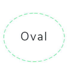
Container(
  width: 50,
  height: 60,
  child: GFBorder(
    type: GFBorderType.oval,
    dashedLine: [2, 0],
    color: Color(0xFF19CA4B),
    strokeWidth: 2,
    child: Center(child: Text('Oval Border')),
  ),
),
GFBorderType.circle
GFBorder can be circular in shape. It can be a solid circle, dotted or dashed circle. The image below shows a dashed circular border with the text in the center. The code for the circular border is given below.
GFBorder property type takes GFBorderType.circle to display circular shape borders.
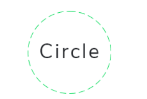
Container(
  width: 100,
  height: 100,
  child: GFBorder(
    type: GFBorderType.circle,
    dashedLine: [4, 6],
    color: Color(0xFF19CA4B),
    strokeWidth: 2,
    child: Center(
        child: Text(
      'Circular Border',
      textAlign: TextAlign.center,
    )),
  ),
),
GF Flutter Border Custom Properties
The look and feel of the GFBorder can be customized using the GFBorder properties.
| Name | Description |
|---|---|
| child | child of type [Widget] which can be any component or text, etc |
| padding | padding for [child] where in padding is given to the border types |
| strokeWidth | storkeWidth of type [double] which is used to define the thickness of the border |
| color | color of type [Color] or GFColor which is used to change the color of the border type |
| dashedLine | dashedLine of type [List<double>] which is used for the linear and simple dashed line of border |
| type | type of [GFBorderType] which is used to define the different types of borders ie, circle, Rect, RRect and oval |
| radius | radius of type [Radius] used to give a curved border only when the border type is RRect, in other cases radius will not work |
Last Updated: September 27, 2023

