
GF Flutter RadioList Tile
Flutter RadioBoxListTile is a list of items wherein the user can check or uncheck only one item in the list. It allows users to select only one option inside the list. GFRadioBoxListTile can also be positioned right or left of the screen according to the need.
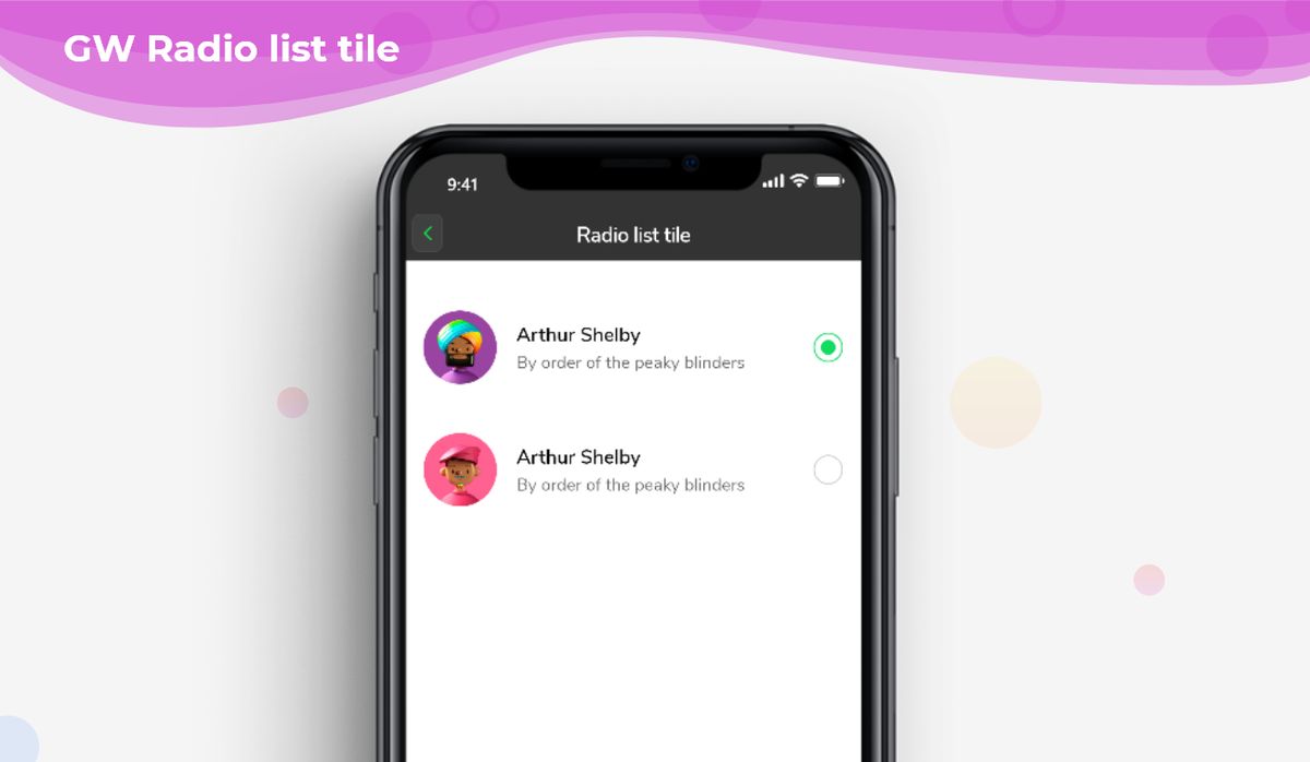
GF Flutter RadioListTile and its Usage:
GFRadioListTile can have a simple list with title or two lines of title and description or with GFAvatar.
The simple code with an avatar of GFRadioListTile is as shown below.

int groupValue = 0;

GFRadioListTile(
  titleText: 'Arthur Shelby',
  subTitleText: 'By order of the peaky blinders',
  avatar: GFAvatar(
    backgroundImage: AssetImage('Assets image here'),
  ),
  size: 25,
  activeBorderColor: Colors.green,
  focusColor: Colors.green,
  type: GFRadioType.square,
  value: 0,
  groupValue: groupValue,
  onChanged: (value) {
    setState(() {
      groupValue = value;
    });
  },
  inactiveIcon: null,
),
GFRadioListTile(
  titleText: 'Arthur Shelby',
  subtitleText: 'By order of the peaky blinders',
  avatar: GFAvatar(
    backgroundImage: AssetImage('Assets image here'),
  ),
  size: 25,
  activeBorderColor: Colors.green,
  focusColor: Colors.green,
  type: GFRadioType.square,
  value: 1,
  groupValue: groupValue,
  onChanged: (value) {
    setState(() {
      groupValue = value;
    });
  },
  inactiveIcon: null,
),

GF Flutter RadioList Tile Custom Properties
The look and feel of the GFRadioListTile can be customized using the GFRadioListTile properties.
| Name | Description |
|---|---|
| type | type of [GFRadioType] which is of four types is basic, suaure, circular, and custom |
| size | type of [double] which is GFSize ie, small, medium, and large and can use any double value |
| radioColor | type pf [Color] used to change the checkcolor when the radio button is active |
| activeBgColor | type of [Color] used to change the backgroundColor of the active radio button |
| inactiveBgColor | type of [Color] used to change the backgroundColor of the inactive radio button |
| activeBorderColor | type of [Color] used to change the border color of the active radio button |
| inactiveBorderColor | type of [Color] used to change the border color of the inactive radio button |
| onChanged | Called when the user checks or unchecks the radio button |
| position | allows the user to set the position of the radiobutton to start or end |
| activeIcon | type of Widget used to change the radio button's active icon |
| inactiveIcon | type of [Widget] used to change the radio button's inactive icon |
| customBgColor | type of [Color] used to change the background color of the custom active radio button only |
| autofocus | on true state, this widget will be selected as the initial focus when no other node in its scope is currently focused |
| focusNode | an optional focus node to use as the focus node for this widget. |
| value | The value represented by this radio button. |
| groupValue | The currently selected value for a group of radio buttons. Radio button is considered selected if its [value] matches the [groupValue]. |
| toggleable | sets the radio value |
| titleText | type of [String] used to pass text, alternative to title property and gets higher priority than the title |
| subTitleText | type of [String] used to pass text, alternative to subtitle property and gets higher priority than the subtitle |
| color | The GFListTile's background color. Can be given [Color] or [GFColors] |
| avatar | type of [Widget] or [GFAvatar] used to create a rounded user profile |
| title | The title to display inside the [GFListTile]. |
| subTitle | The subtitle to display inside the [GFListTile]. |
| description | The description to display inside the [GFListTile]. |
| icon | The icon to display inside the [GFListTile]. |
| margin | defines the margin of GFListTile |
| padding | defines the padding of GFListTile |
| enabled | <p>Whether this list tile is interactive. If false, this list tile is styled with the disabled color from the current [Theme] and the [onTap] and [onLongPress] callbacks are</p><p>inoperative.</p> |
| onTap | Called when the user taps this list tile. Inoperative if [enabled] is false. |
| onLongPress | Called when the user long-presses on this list tile. Inoperative if [enabled] is false. |
| selected | <p>If this tile is also [enabled] then icons and text are rendered with the same color.</p><p>By default the selected color is the theme's primary color. The selected color can be overridden with a [ListTileTheme].</p> |
| focusColor | The color for the tile's [Material] when it has the input focus. |
| hoverColor | The color for the tile's [Material] when a pointer is hovering over it. |
Last Updated: September 21, 2023

