
GF Flutter List Tile
GFListTile is a Flutter ListTile that is a widget used to populate a ListView in an application. It generally has a title, and one to three lines of description or subtitle, and a trailing icon. The ListTile background color can be changed using the color property.
GF Flutter ListTile Example
The simple GF ListTile code is as shown below
import 'package:getwidget/getwidget.dart';

GFListTile(
  titleText:'Title',
  subTitleText:'Lorem ipsum dolor sit amet, consectetur adipiscing',
  icon: Icon(Icons.favorite)
),

GF Flutter ListTile With Avatar
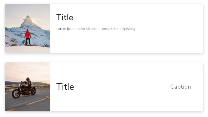
GFListTile can have an avatar in the starting position in it. The avatar is usually a background image or just a profile image.
The simple code of GF Flutter ListTile with the avatar is as shown below
import 'package:getwidget/getwidget.dart';

GFListTile(
  avatar:GFAvatar(),
  titleText:'Title',
  subTitleText:'Lorem ipsum dolor sit amet, consectetur adipiscing',
  icon: Icon(Icons.favorite)
),
GF FlutterListTile Custom Properties
GF ListTile has some of its custom properties to create a smooth look and feel for the application. The below table shows the custom properties:
| Name | Description |
|---|---|
| color | The GFListTile's background color. Can be given [Color] or [GFColors] |
| description | The description to display inside the [GFListTile]. see [Text] |
| padding | defines the padding of GFListTile |
| margin | defines the margin of GFListTile |
| titleText | type of [String] used to pass text, alternative to title property and gets higher priority than the title |
| subTitleText | type of [String] used to pass text, alternative to subtitle property and gets higher priority than the subtitle |
| avatar | type of [Widget] or [GFAvatar] used to create a rounded user profile |
| title | The title to display inside the [GFListTile]. see [Text] |
| subTitle | The subtitle to display inside the [GFListTile]. see [Text] |
| icon | The icon to display inside the [GFListTile]. see [Icon] |
| enabled | Whether this list tile is interactive. If false, this list tile is styled with the disabled color from the current [Theme] and the [onTap] and [onLongPress] callbacks are inoperative. |
| onTap | Called when the user taps this list tile. Inoperative if [enabled] is false. |
| onLongPress | Called when the user long-presses on this list tile. Inoperative if [enabled] is false. |
| selected | If this tile is also [enabled] then icons and text are rendered with the same color. By default the selected color is the theme's primary color. The selected color can be overridden with a [ListTileTheme]. |
| focusColor | The color for the tile's [Material] when it has the input focus. |
| hoverColor | The color for the tile's [Material] when a pointer is hovering over it. |
| focusNode | Defines the keyboard focus for this widget. |
| autofocus | On true state, it should focus itself if nothing else is already focused. Defaults to false |
Last Updated: September 27, 2023

