
GF Introduction Screen
GF Flutter Intro Screen or Welcome Screen
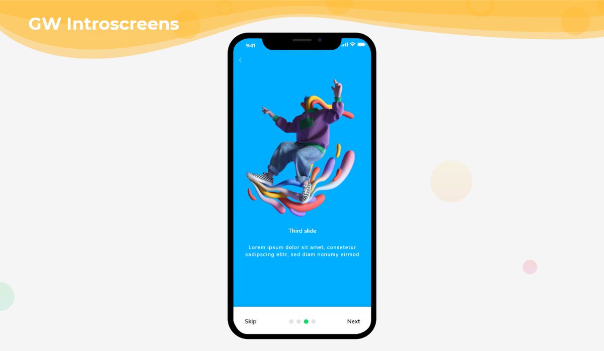
GFIntro Screen is a Flutter Introduction Screen that has sliders and gives information about the application. It can have as many slides as the application needs. It is a user-friendly widget that pops upon opening the application to give a brief introduction to the app.

The simple code of a basic GF Introduction Screen is as shown below.

late PageController _pageController;
List<Widget> slideList;
int initialPage;

@override
void initState() {
  _pageController = PageController(initialPage: 2);
  initialPage = _pageController.initialPage;
  super.initState();
}

@override
Widget build(BuildContext context) {
  return SafeArea(
    child: GFIntroScreen(
      color: Colors.blueGrey,
      slides: slides(),
      pageController: _pageController,
      currentIndex: inittialIndex,
      pageCount: 5,
      introScreenBottomNavigationBar: GFIntroScreenBottomNavigationBar(
        pageController: _pageController,
        pageCount: slideList.length,
        currentIndex: initialPage,
        onForwardButtonTap: () {
          _pageController.nextPage(
              duration: const Duration(milliseconds: 500),
              curve: Curves.linear);
        },
        onBackButtonTap: () {
          _pageController.previousPage(
              duration: const Duration(milliseconds: 500),
              curve: Curves.linear);
        },
        navigationBarColor: Colors.white,
        showDivider: false,
        inActiveColor: Colors.grey[200],
        activeColor: GFColors.SUCCESS,
      ),
    ),
  );
}

List<Widget> slides() {
  slideList = [
    Container(
      child: GFImageOverlay(
        width: MediaQuery.of(context).size.width,
        padding: EdgeInsets.all(16),
        child: Row(
          crossAxisAlignment: CrossAxisAlignment.start,
          children: <Widget>[
            Padding(
              padding: const EdgeInsets.only(top: 70.0, left: 20),
              child: Text(
                'Welcome!',
                style: TextStyle(
                    color: Colors.white,
                    decoration: TextDecoration.none,
                    fontSize: 25),
              ),
            ),
          ],
        ),
        color: Colors.orange,
        image: const AssetImage('assets image here'),
        boxFit: BoxFit.cover,
        colorFilter:
            ColorFilter.mode(Colors.black.withOpacity(0.2), BlendMode.darken),
        borderRadius: BorderRadius.circular(5),
      ),
    ),
    Container(
      width: MediaQuery.of(context).size.width,
      height: MediaQuery.of(context).size.height,
      decoration: BoxDecoration(
          borderRadius: BorderRadius.circular(0),
          image: DecorationImage(
            image: AssetImage('assets image here'),
            fit: BoxFit.cover,
            colorFilter: ColorFilter.mode(
                Colors.black.withOpacity(0.2), BlendMode.darken),
          )),
    ),
  ];
  return slideList;
}

GF Flutter Intro Screen Bottom Navigation Bar
GF IntroScreen Bottom NavigationBar is a bottom bar that sits at the bottom end of the screen. This component contains pagination and buttons for navigation. It has many features for customizing the bottom navigation bar.
late PageController _pageController;
int initialPage;

@override
void initState() {
  _pageController = PageController(initialPage: 2);
  initialPage = _pageController.initialPage;
  super.initState();
}

GFIntroScreen(
  color: Colors.blueGrey,
  slides: slides(),
  pageController: _pageController,
  currentIndex: inittialIndex,
  pageCount: 5,
  introScreenBottomNavigationBar: GFIntroScreenBottomNavigationBar(
    pageController: _pageController,
    pageCount: slideList.length,
    currentIndex: initialPage,
  ),
),
GF Flutter Introduction Custom Screen
GFIntroScreen and GFIntroScreenBottomNavigationBar components features allows user to create customized intro screen with or without BottomNavigationBar for the more flexible and interactive UI design.
late PageController _pageController;
List<Widget> slideList;
int initialPage;

@override
void initState() {
  _pageController = PageController(initialPage: 2);
  initialPage = _pageController.initialPage;
  super.initState();
}

@override
Widget build(BuildContext context) => Scaffold(
      backgroundColor:  Colors.grey[200],
      body: SafeArea(
        child: GFIntroScreen(
          height: MediaQuery.of(context).size.height*0.7,
          width: MediaQuery.of(context).size.width * 0.9,
          color: Colors.grey[200],
          borderRadius: BorderRadius.circular(40),
          border: Border.all(color: Colors.grey[200]),
          slides: slides(),
          pageController: _pageController,
          introScreenBottomNavigationBar: GFIntroScreenBottomNavigationBar(
            pageController: _pageController,
            pageCount: slideList.length,
            currentIndex: initialPage,
            backButtonText: 'Previous',
            forwardButtonText: 'Next',
            skipButtonText: 'Skip',
            doneButtonText: 'Done',
            navigationBarHeight: 50,
            navigationBarWidth: 300,
            navigationBarShape: RoundedRectangleBorder(
              borderRadius: BorderRadius.circular(60),
            ),
            navigationBarColor: Colors.white,
            showDivider: false,
            dotHeight: 10,
            dotWidth: 16,
            dotShape: RoundedRectangleBorder(
                borderRadius: BorderRadius.circular(5)),
            inActiveColor: Colors.grey[200],
            activeColor: GFColors.SUCCESS,
            dotMargin: EdgeInsets.symmetric(horizontal: 6),
            showPagination: true,
          ), currentIndex: null, pageCount: null,
        ),
      ),
    );

List<Widget> slides() {
  slideList = [
    Container(
      child: GFImageOverlay(
        width: MediaQuery.of(context).size.width,
        padding: EdgeInsets.all(16),
        child: Row(
          crossAxisAlignment: CrossAxisAlignment.start,
          children: <Widget>[
            Padding(
              padding: const EdgeInsets.only(top: 10.0, left: 20),
              child: Text(
                'Welcome Back!',
                style: TextStyle(color: Colors.white,decoration: TextDecoration.none,fontSize: 25),
              ),
            ),
          ],
        ),
        color: Colors.orange,
        image: const AssetImage('lib/assets/images/i1.png'),
        boxFit: BoxFit.cover,
        colorFilter:
            ColorFilter.mode(Colors.black.withOpacity(0.2), BlendMode.darken),
        borderRadius: BorderRadius.only(
            topLeft: Radius.circular(40), topRight: Radius.circular(40)),
      ),
    ),
    Container(
      width: MediaQuery.of(context).size.width,
      height: MediaQuery.of(context).size.height,
      decoration: BoxDecoration(
          borderRadius: BorderRadius.only(
              topLeft: Radius.circular(40), topRight: Radius.circular(40)),
          image: DecorationImage(
            image: AssetImage('asset image here'),
            fit: BoxFit.fill,
            colorFilter: ColorFilter.mode(
                Colors.black.withOpacity(0.2), BlendMode.darken),
          )),
    ),
  ];
  return slideList;
}
GF Flutter IntroScreen Custom Properties
Look and feel of the GFIntroScreen can be customized using the GFIntroScreen properties.
| Name | Description |
|---|---|
| slides | defines the list of slides |
| pageController | allows one to control [GFIntroScreen] slides |
| color | defines background color of the [GFIntroScreen] slides |
| height | defines [GFIntroScreen] slides height |
| width | defines [GFIntroScreen] slides width |
| borderRadius | defines [GFIntroScreen] border radius to defines slides shape |
| border | defines [GFIntroScreen] slides border |
| introScreenBottomNavigationBar ** | defines [GFIntroScreen]'s bottom navigation bar |
| showIntroScreenBottomNavigationBar | on true state, displays [GFIntroScreenBottomNavigationBar], defaults to true |
| currentIndex | defines the currentIndex of [GFIntroScreen] slides, default value is 0 |
| pageCount | defines the length of [GFIntroScreen] slides, default value is 0 |
| child | defines [GFIntroScreenBottomNavigationBar]'s child, it takes any widget |
| navigationBarHeight | defines [GFIntroScreenBottomNavigationBar] height |
| navigationBarWidth | defines [GFIntroScreenBottomNavigationBar] width |
| navigationBarPadding | defines [GFIntroScreenBottomNavigationBar] padding |
| navigationBarMargin | defines [GFIntroScreenBottomNavigationBar] margin |
| navigationBarColor | defines [GFIntroScreenBottomNavigationBar] color |
| navigationBarShape | defines the shape of [GFIntroScreenBottomNavigationBar] |
| onForwardButtonTap | called when the [forwardButtonText] is tapped |
| onBackButtonTap | called when the [backButtonText] is tapped |
| onDoneTap | called when the [doneButtonText] is tapped |
| onSkipTap | called when the [skipButtonText] is tapped |
| backButton | takes any Widget to define the backButton widget |
| forwardButton | takes any Widget to define the forwardButton widget |
| doneButton | takes any Widget to define the doneButton widget |
| skipButton | takes any Widget to define the skipButton widget |
| backButtonText | takes String to define backButton text |
| forwardButtonText | takes String to define forwardButton text |
| doneButtonText | takes String to define doneButton text |
| skipButtonText | takes String to define skipButton text |
| skipButtonTextStyle | defines the skipButton textStyle |
| doneButtonTextStyle | defines the doneButton textStyle |
| backButtonTextStyle | defines the backButton textStyle |
| forwardButtonTextStyle | defines the forwardButton textStyle |
| showDivider | on true state, displays [Divider], defaults to true |
| showButton | on true state, displays buttons, defaults to true |
| showPagination | on true state, displays pagination, defaults to true |
| dividerHeight | defines divider height |
| dividerThickness | defines divider thickness |
| dividerColor | defines divider color |
| dotShape | defines pagination shape |
| inactiveColor | defines pagination inactive color |
| activeColor | defines pagination active color |
| dotHeight | defines pagination height |
| dotWidth | defines pagination width |
| dotMargin | defines pagination in between space |
Last Updated: September 21, 2023

