
GF Flutter Radio Button
Flutter RadioBox Button permits the user to select only one option in any two sets of mutual options as it is the flutter radio button default selected. The radio button has to be checked or unchecked only once in a given set of options.

GF Flutter Radio Button and its Usage
GFRadioButton or radio button flutter has to be checked only one at a time and other options are by default unchecked as radio buttons allow only one option to be checked at a time.
The code below gives a simple Flutter radio button.
int groupValue = 0;

GFRadio(
  size: GFSize.SMALL,
  value: 2,
  groupValue: groupValue,
  onChanged: (value) {
    setState(() {
      groupValue = value;
    });
  },
  inactiveIcon: null,
  activeBorderColor: GFColors.SUCCESS,
  radioColor: GFColors.SUCCESS,
),

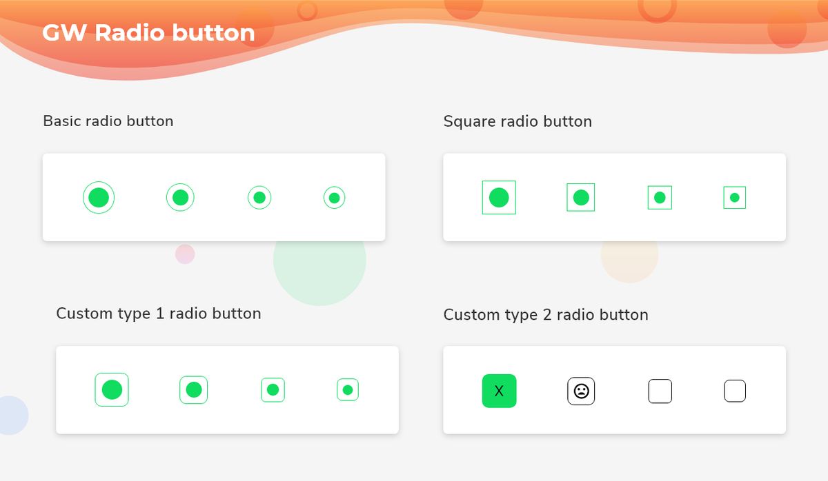
Flutter Basic Radio Button
GFRadioButton has many types in it and the basic type is a circular radio button. The shape is of a circle and hence the name circular and it is a basic type as shown in the below image. Let us look at the example below
int groupValue = 0;

GFCard(
    content: Row(
      mainAxisAlignment: MainAxisAlignment.spaceBetween,
      children: <Widget>[
        GFRadio(
          size: GFSize.LARGE,
          activeBorderColor: GFColors.SUCCESS,
          value: 0,
          groupValue: groupValue,
          onChanged: (val) {
            setState(() {
              groupValue = value;
            });
          },
          inactiveIcon: null,
          radioColor: GFColors.SUCCESS,
        ),
        GFRadio(
          size: GFSize.MEDIUM,
          value: 1,
          groupValue: groupValue,
          onChanged: (value) {
            setState(() {
              groupValue = value;
            });
          },
          inactiveIcon: null,
          activeBorderColor: GFColors.SUCCESS,
          radioColor: GFColors.SUCCESS,
        ),
        GFRadio(
          size: GFSize.SMALL,
          value: 2,
          groupValue: groupValue,
          onChanged: (value) {
            setState(() {
              groupValue = value;
            });
          },
          inactiveIcon: null,
          activeBorderColor: GFColors.SUCCESS,
          radioColor: GFColors.SUCCESS,
        ),
        GFRadio(
          size: 20,
          value: 3,
          groupValue: groupValue,
          onChanged: (value) {
            setState(() {
              groupValue = value;
            });
          },
          inactiveIcon: null,
          activeBorderColor: GFColors.SUCCESS,
          radioColor: GFColors.SUCCESS,
        )
      ],
    )),
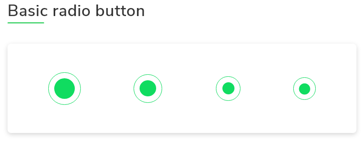
Flutter Square Radio Button
GFRadioButton can be a square type. The outer border will not have any border-radius and the shape will be of a square and hence the name square radio button as shown in the below image. Let us look at the example below :
int groupValue = 0;

GFCard(
    content: Row(
      mainAxisAlignment: MainAxisAlignment.spaceBetween,
      children: <Widget>[
        GFRadio(
          type: GFRadioType.square,
          size: GFSize.LARGE,
          value: 4,
          groupValue: groupValue,
          onChanged: (value) {
            setState(() {
              groupValue = value;
            });
          },
          inactiveIcon: null,
          activeBorderColor: GFColors.SUCCESS,
          radioColor: GFColors.SUCCESS,
        ),
        GFRadio(
          type: GFRadioType.square,
          size: GFSize.MEDIUM,
          value: 5,
          groupValue: groupValue,
          onChanged: (value) {
            setState(() {
              groupValue = value;
            });
          },
          inactiveIcon: null,
          activeBorderColor: GFColors.SUCCESS,
          radioColor: GFColors.SUCCESS,
        ),
        GFRadio(
          type: GFRadioType.square,
          size: GFSize.SMALL,
          value: 6,
          groupValue: groupValue,
          onChanged: (value) {
            setState(() {
              groupValue = value;
            });
          },
          inactiveIcon: null,
          activeBorderColor: GFColors.SUCCESS,
          radioColor: GFColors.SUCCESS,
        ),
        GFRadio(
          type: GFRadioType.square,
          size: 20,
          value: 7,
          groupValue: groupValue,
          onChanged: (value) {
            setState(() {
              groupValue = value;
            });
          },
          inactiveIcon: null,
          activeBorderColor: GFColors.SUCCESS,
          radioColor: GFColors.SUCCESS,
          activeIcon: Icon(Icons.close),
        )
      ],
    )),
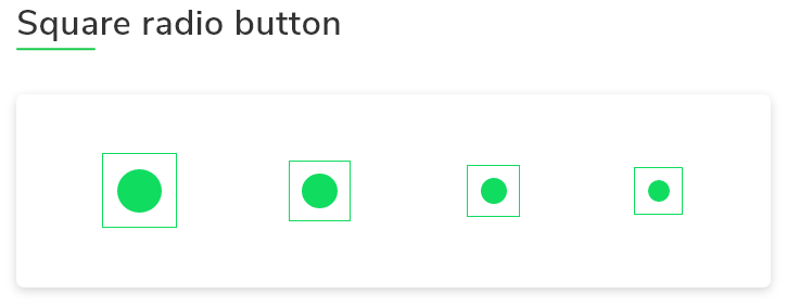
Flutter Custom Radio Button Type-1
GFRadioButton can be a custom type. The outer border will have little border-radius and comes in different sizes as shown in the below image.
Let us look at the example demo code for the custom radio button below :
int groupValue = 0;

GFCard(
    content: Row(
      mainAxisAlignment: MainAxisAlignment.spaceBetween,
      children: <Widget>[
        GFRadio(
            type: GFRadioType.blunt,
            size: GFSize.LARGE,
            activeBorderColor: GFColors.SUCCESS,
            value: 8,
            groupValue: groupValue,
            onChanged: (value) {
              setState(() {
                groupValue = value;
              });
            },
            inactiveIcon: null,
            customBgColor: GFColors.SUCCESS),
        GFRadio(
          type: GFRadioType.blunt,
          size: GFSize.MEDIUM,
          value: 9,
          groupValue: groupValue,
          onChanged: (value) {
            setState(() {
              groupValue = value;
            });
          },
          inactiveIcon: null,
          activeBorderColor: GFColors.SUCCESS,
          customBgColor: GFColors.SUCCESS,
        ),
        GFRadio(
          type: GFRadioType.blunt,
          size: GFSize.SMALL,
          value: 10,
          groupValue: groupValue,
          onChanged: (value) {
            setState(() {
              groupValue = value;
            });
          },
          inactiveIcon: null,
          activeBorderColor: GFColors.SUCCESS,
          customBgColor: GFColors.SUCCESS,
        ),
        GFRadio(
          type: GFRadioType.blunt,
          size: 25,
          value: 11,
          groupValue: groupValue,
          onChanged: (value) {
            setState(() {
              groupValue = value;
            });
          },
          inactiveIcon: null,
          activeBorderColor: GFColors.SUCCESS,
          customBgColor: GFColors.SUCCESS,
        )
      ],
    )),
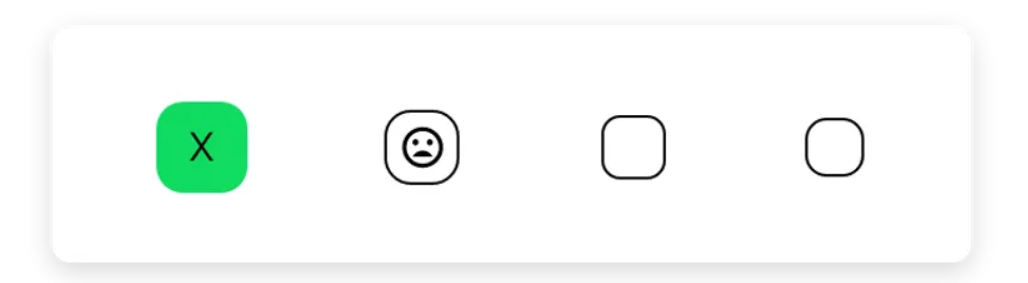
Flutter Custom Radio Button Type 2
GFRadioButton can be a custom type 2 wherein the checked box can be any type of widget like an icon, background color, etc as shown in the image below.
Let us look at the example code below :
int groupValue = 0;

GFCard(
    content: Row(
      mainAxisAlignment: MainAxisAlignment.spaceBetween,
      children: <Widget>[
        GFRadio(
          type: GFRadioType.custom,
          activeIcon: Icon(Icons.check),
          radioColor: Colors.red,
          size: GFSize.LARGE,
          activeBgColor: GFColors.SUCCESS,
          inactiveBorderColor: GFColors.DARK,
          activeBorderColor: GFColors.SUCCESS,
          value: 12,
          groupValue: groupValue,
          onChanged: (value) {
            setState(() {
              groupValue = value;
            });
          },
        ),
        GFRadio(
          type: GFRadioType.custom,
          activeIcon: Icon(Icons.sentiment_satisfied),
          size: GFSize.MEDIUM,
          value: 13,
          groupValue: groupValue,
          onChanged: (value) {
            setState(() {
              groupValue = value;
            });
          },
          inactiveIcon: Icon(Icons.sentiment_dissatisfied),
          customBgColor: GFColors.WARNING,
          activeBgColor: GFColors.SUCCESS,
          activeBorderColor: GFColors.SUCCESS,
        ),
        GFRadio(
          type: GFRadioType.blunt,
          size: GFSize.SMALL,
          value: 14,
          groupValue: groupValue,
          onChanged: (value) {
            setState(() {
              groupValue = value;
            });
          },
          inactiveIcon: null,
          customBgColor: GFColors.SUCCESS,
          activeBorderColor: GFColors.SUCCESS,
        ),
        GFRadio(
          type: GFRadioType.blunt,
          size: 25,
          value: 15,
          groupValue: groupValue,
          onChanged: (value) {
            setState(() {
              groupValue = value;
            });
          },
          inactiveIcon: null,
          activeBorderColor: GFColors.SUCCESS,
          customBgColor: GFColors.SUCCESS,
        ),
      ],
    )),
GF Flutter Radio Button Custom Properties
The look and feel of the GFRadio button can be customized using the GFRadio properties.
| Name | Description |
|---|---|
| type | type of [GFRadioType] which is of four type is basic, sqaure, circular and custom |
| size | type of [double] which is GFSize ie, small, medium and large and can use any double value |
| radioColor | type pf [Color] used to change the checkcolor when the radio button is active |
| activeBgColor | type of [Color] used to change the backgroundColor of the active radio button |
| inactiveBgColor | type of [Color] used to change the backgroundColor of the inactive radio button |
| activeBorderColor | type of [Color] used to change the border color of the active radio button |
| inactiveBorderColor | type of [Color] used to change the border color of the inactive radio button |
| onChanged | Called when the user checks or unchecks the radio button |
| activeIcon | type of Widget used to change the radio button's active icon |
| inactiveIcon | type of [Widget] used to change the radio button's inactive icon |
| customBgColor | type of [Color] used to change the background color of the custom active radio button only |
| autofocus | on true state this widget will be selected as the initial focus when no other node in its scope is currently focused |
| focusNode | an optional focus node to use as the focus node for this widget. |
| value | The value represented by this radio button. |
| groupValue | The currently selected value for a group of radio buttons. Radio button is considered selected if its [value] matches the [groupValue]. |
| toggleable | sets the radio value |
Last Updated: September 26, 2023

