
GF Flutter Checkbox
GF Flutter Checkbox and Example
GFCheckbox is a Flutter CheckBox widget that permits the user to select one or more than one option in a given set of lists. It can have any number of possible ticks. The user can check and uncheck on the boxes provided.
The simple code of a basic GFCheckbox example code is as shown below.
bool isChecked = false;

GFCheckbox(
  size: GFSize.SMALL,
  activeBgColor: GFColors.DANGER,
  onChanged: (value) {
    setState(() {
      isChecked = value;
    });
  },
  value: isChecked,
),

GF Basic Flutter Checkbox
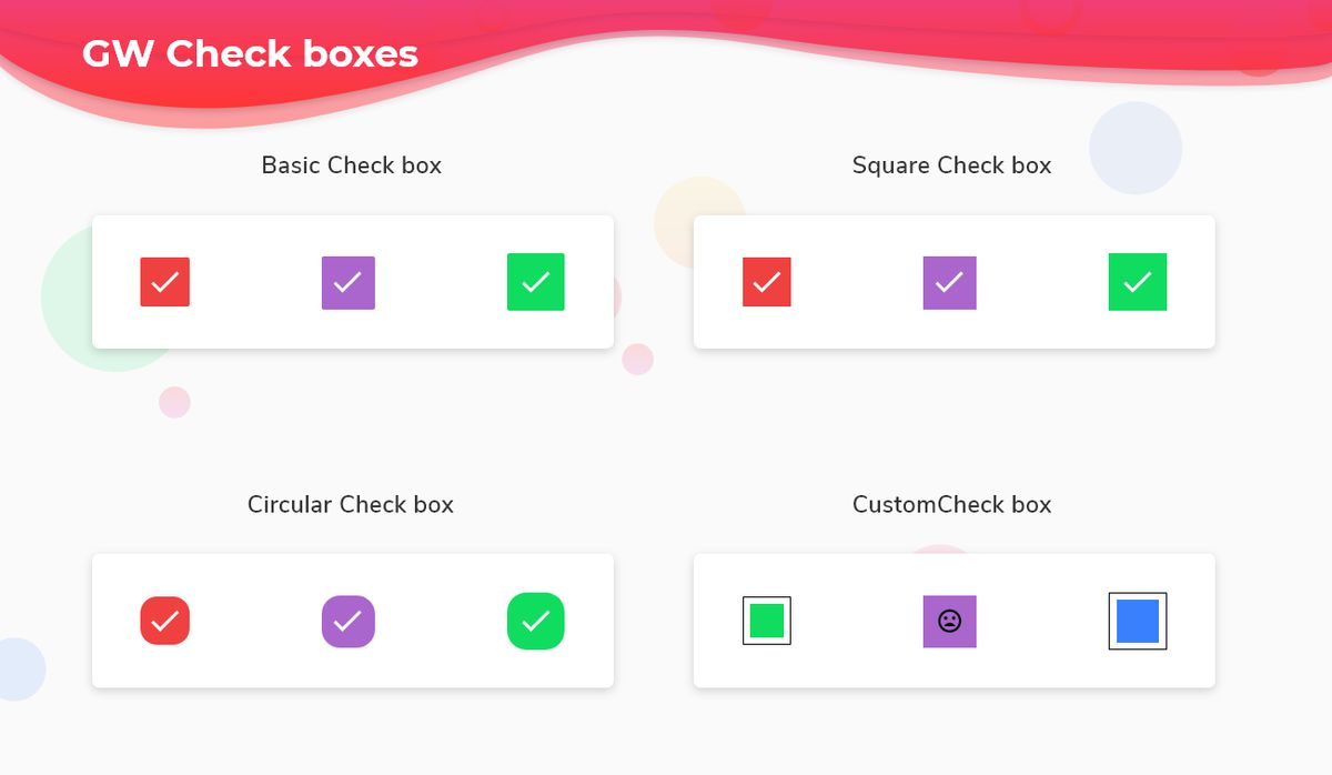
GFCheckbox has many kinds and one of them is a basic or standard type of checkbox. Here the box will have a slight border-radius around it as shown in the below image. The code below gives a basic or standard checkbox

The simple code of a basic Basic Flutter Checkbox example code is as shown below.
bool isChecked = false;

GFCard(
 content: Row(
 mainAxisAlignment: MainAxisAlignment.spaceBetween,
 children: <Widget>[
   GFCheckbox(
     size: GFSize.SMALL,
     activeBgColor: GFColors.DANGER,
     onChanged: (value) {
       setState(() {
         isChecked = value;
       });
     },
     value: isChecked,
     inactiveIcon: null,
   ),
  GFCheckbox(
    activeBgColor: GFColors.SECONDARY,
    onChanged: (value) {
      setState(() {
        isChecked = value;
      });
    },
    value: isChecked,
    inactiveIcon: null,
   ),
   GFCheckbox(
     size: GFSize.LARGE,
     activeBgColor: GFColors.SUCCESS,
     onChanged: (value) {
       setState(() {
         isChecked = value;
       });
     },
     value: isChecked,
     inactiveIcon: null,
    ),
   ],
  ),
),
GF Square Flutter Checkbox
GFCheckbox has square type checkbox. Here the box will not have any border radius and it will be in a square shape as shown in the below image. Hence the name Square Checkbox. The below code shows the example of a square checkbox:
The simple code of a basic Basic Flutter square Checkbox example code is as shown below.
bool isChecked = false;

GFCard(
  content: Row(
    mainAxisAlignment: MainAxisAlignment.spaceBetween,
    children: <Widget>[
      GFCheckbox(
        size: GFSize.SMALL,
        activeBgColor: GFColors.DANGER,
        type: GFCheckboxType.square,
        onChanged: (value) {
          setState(() {
            isChecked = value;
          });
        },
        value: isChecked,
        inactiveIcon: null,
      ),
      GFCheckbox(
        type: GFCheckboxType.square,
        activeBgColor: GFColors.SECONDARY,
        onChanged: (value) {
          setState(() {
            isChecked = value;
          });
        },
        value: isChecked,
        inactiveIcon: null,
      ),
      GFCheckbox(
        size: GFSize.LARGE,
        activeBgColor: GFColors.SUCCESS,
        type: GFCheckboxType.square,
        onChanged: (value) {
          setState(() {
            isChecked = value;
          });
        },
        value: isChecked,
        inactiveIcon: null,
      ),
    ],
  ),
),
Flutter Circle Checkbox:
GFCheckbox has circle-type checkbox. Here the box will have a circle shape as shown in the below image. Hence the name Circular Checkbox. The below code shows the example of a circular checkbox:

The simple code of a basic Basic Flutter Circle Checkbox example code is as shown below.
bool isChecked = false;

GFCard(
  content: Row(
    mainAxisAlignment: MainAxisAlignment.spaceBetween,
    children: <Widget>[
      GFCheckbox(
        size: GFSize.SMALL,
        activeBgColor: GFColors.DANGER,
        type: GFCheckboxType.circle,
        onChanged: (value) {
          setState(() {
            isChecked = value;
          });
        },
        value: isChecked,
        inactiveIcon: null,
      ),
      GFCheckbox(
        type: GFCheckboxType.circle,
        activeBgColor: GFColors.SECONDARY,
        onChanged: (value) {
          setState(() {
            isChecked = value;
          });
        },
        value: isChecked,
      ),
      GFCheckbox(
        activeBgColor: GFColors.SUCCESS,
        size: GFSize.LARGE,
        type: GFCheckboxType.circle,
        onChanged: (value) {
          setState(() {
            isChecked = value;
          });
        },
        value: isChecked,
        inactiveIcon: null,
      ),
    ],
  ),
),
GF Flutter Custom Checkbox
GFCheckbox has custom type checkbox. Here the box will have any custom items like icons or background color when the box is checked as shown in the below image. Hence the name Custom Checkbox. The below code shows the example of a square checkbox:

The simple code of a basic Basic Flutter Custom Checkbox example code is as shown below.
bool isChecked = false;

GFCard(
  content: Row(
    mainAxisAlignment: MainAxisAlignment.spaceBetween,
    children: <Widget>[
      GFCheckbox(
        size: GFSize.SMALL,
        type: GFCheckboxType.custom,
        onChanged: (value) {
          setState(() {
            isChecked = value;
          });
        },
        value: isChecked,
        inactiveIcon: null,
      ),
      GFCheckbox(
        type: GFCheckboxType.square,
        activeBgColor: GFColors.SECONDARY,
        activeIcon: Icon(Icons.sentiment_satisfied),
        onChanged: (value) {
          setState(() {
            isChecked = value;
          });
        },
        value: isChecked,
        inactiveIcon: Icon(Icons.sentiment_dissatisfied),
      ),
      GFCheckbox(
        size: GFSize.MEDIUM,
        type: GFCheckboxType.custom,
        onChanged: (value) {
          setState(() {
            isChecked = value;
          });
        },
        value: isChecked,
        custombgColor: GFColors.INFO,
      ),
    ],
  ),
),
GF Flutter Checkbox Custom Properties
The Look and feel of the GFCheckbox can be customized using the GFCheckbox properties.
| Name | Description |
|---|---|
| type | type of [GFCheckboxType] which is of four type is basic, square, circular and custom |
| size | type of [double] which is GFSize ie, small, medium and large and can use any double value |
| activeBgColor | type of [Color] used to change the backgroundColor of the active checkbox |
| inactiveBgColor | type of [Color] used to change the backgroundColor of the inactive checkbox |
| activeBorderColor | type of [Color] used to change the border color of the active checkbox |
| inactiveBorderColor | type of [Color] used to change the border color of the inactive checkbox |
| onChanged | called when the user checks or unchecks the checkbox. |
| value | used to set the current state of the checkbox |
| activeIcon | type of [Widget] used to change the checkbox's active icon |
| inactiveIcon | type of [Widget] used to change the checkbox's inactive icon |
| customBgColor | type of [Color] used to change the background color of the custom active checkbox only |
| autofocus | on true state this widget will be selected as the initial focus when no other node in its scope is currently focused |
| focusNode | an optional focus node to use as the focus node for this widget. |
Last Updated: September 21, 2023

