
Flutter Square Button

GF Flutter Buttons are clickable buttons that are used widely in an application. GFButtons come in many shapes and one of the shapes is a square-shaped button.
We will be able to get a flutter square-shaped button with solid background color with no rounded corners by adding property shape with GFButtonShape.square .
import 'package:getwidget/getwidget.dart';

GFButton(
    onPressed: (){},
    text: "primary",
    shape: GFButtonShape.square,
  ),

Flutter Square Solid Button
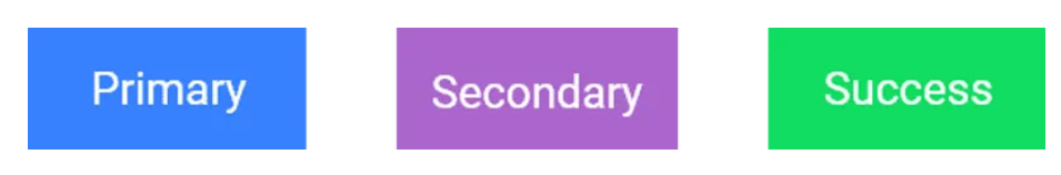
By default, the button type is set to GFButtonType.solid so, we were able to get a square-shaped button that has a solid background color with no rounded corners.
The callback is called when the button is tapped. By adding a callback to onPressed enables the button.
import 'package:getwidget/getwidget.dart';

  GFButton(
    onPressed: (){},
    text: "primary",
    shape: GFButtonShape.square,
  ),
Flutter Square Disabled Button
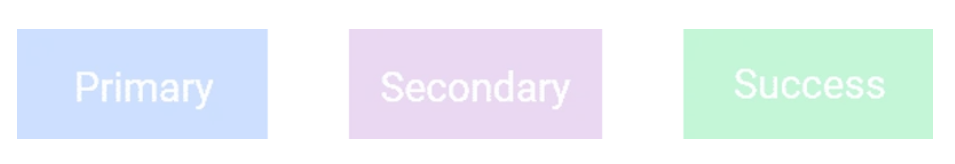
If this callback and onPressed are null, then the button will be disabled. Default GFButton will be disabled as onPressed is set to null.
import 'package:getwidget/getwidget.dart';

GFButton(
    onPressed: null,
    text: "primary",
    shape: GFButtonShape.square,
 ),
Flutter Square Block Button
The Flutter Block button specifies how wide the button should be. By setting blockButton state,true it will change the button to a full-width block with no rounded corners. Default blockButton is set to false.
import 'package:getwidget/getwidget.dart';

GFButton(
    onPressed: (){},
    text: "primary",
    shape: GFButtonShape.square,
    blockButton: true,
 ),
Flutter Square Full-Width Button
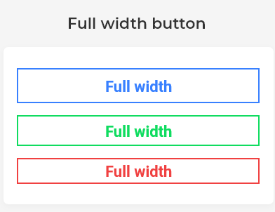
The Flutter Full-Width button specifies the button should be in full width of the screen. By setting a fullWidthButton state,true it will change the button to a Full-width button with rounded corners and no border on the left or right side. Default fullWidthButton set to false.
import 'package:getwidget/getwidget.dart';

GFButton(
    onPressed: (){},
    text: "primary",
    shape: GFButtonShape.square,
    fullWidthButton: true,
 ),
Flutter Square Button Size Properties
Flutter Button size can be varied using the size property, which specifies the size of the button. Default button size is set to GFSize.MEDIUM.
import 'package:getwidget/getwidget.dart';

GFButton(
    onPressed: (){},
    text: "primary",
    shape: GFButtonShape.square,
    size: GFSize.SMALL,
 ),
Flutter Square Outline Button
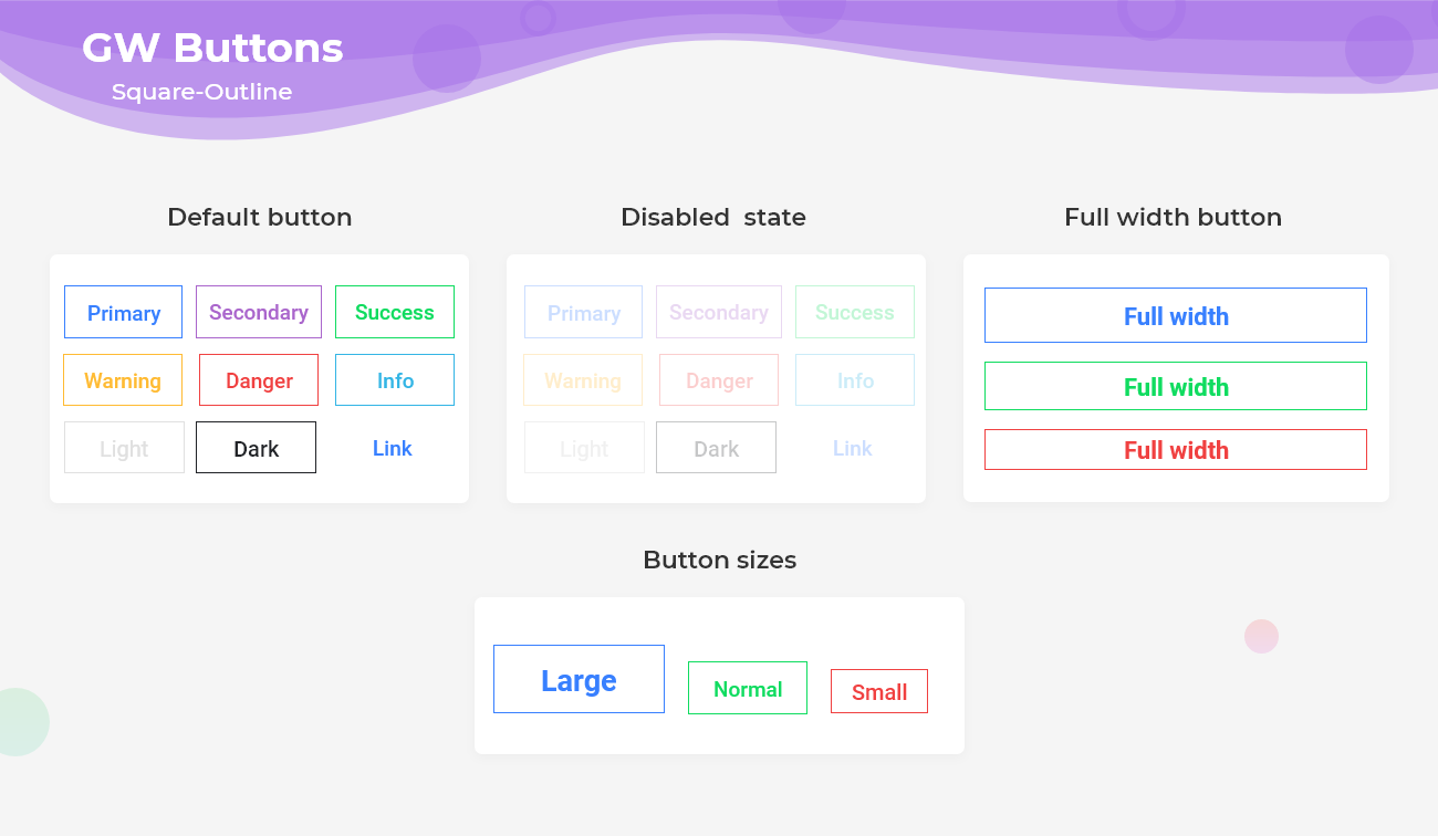
Flutter Outline Button describes the button with a transparent background and a visible border. This button can be easily found in GFButton by adding type as GFButtonType.outline.
import 'package:getwidget/getwidget.dart';

GFButton(
    onPressed: (){},
    text: "primary",
    shape: GFButtonShape.square,
    type: GFButtonType.outline,
 ),
Above mentioned properties like size, blockButton, fullWidthButton, enabling and disabling of button works well in Outline Button also.
Flutter Square Outline2x Button
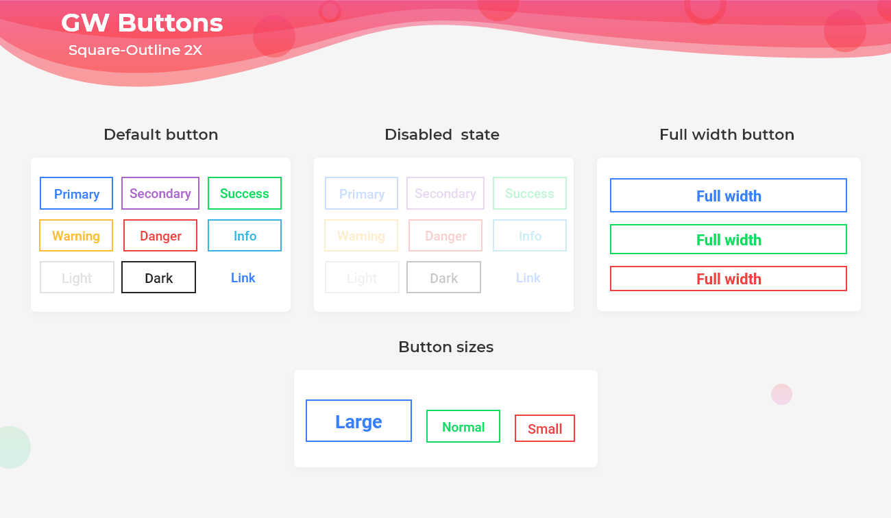
Flutter Outline2x Button describes the Button with a transparent background and a visible border with 2x border width. This button can be easily found in GFButton by adding type as GFButtonType.outline2x.
import 'package:getwidget/getwidget.dart';

GFButton(
    onPressed: (){},
    text: "primary",
    shape: GFButtonShape.square,
    type: GFButtonType.outline2x,
 ),
Above mentioned properties like size, blockButton, fullWidthButton, enabling and disabling of button works well in Outline2x Button also.
Last Updated: September 26, 2023

