
GF Create Custom Flutter Card Widget Example

GF Flutter Card Example
Card is a build-in widget and a most used widget in flutter. The card has a rounded corners around it with a slight elevation to give it a smooth and user-friendly look to the application. It has many customized properties like color, shape etc which can be used accordingly.
GFCard is a Flutter Card that is used in any section of the application to display certain types of information about the application. It can be simply used with a title and Flutter buttons.
A Flutter card typically has a slight border radius and box shadow around it that gives a classic look to the card. It typically has two action buttons, some information and it can even contain images in it.
The simple code of a Flutter card is shown below.
import 'package:getwidget/getwidget.dart';

GFCard(
 boxFit: BoxFit.cover,
 image: Image.asset('your asset image'),
 title: GFListTile(
   avatar: GFAvatar(
     backgroundImage: AssetImage('your asset image'),
   ),
   title: Text('Card Title'),
   subTitle: Text('Card Sub Title'),
),
content: Text("Some quick example text to build on the card"),
buttonBar: GFButtonBar(
 children: <Widget>[
   GFButton(
    onPressed: () {},
    text: 'Buy',
   ),
   GFButton(
    onPressed: () {},
    text: 'Cancel',
   ),
 ],
 ),
),

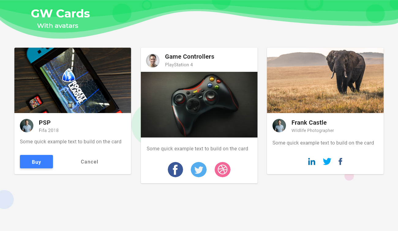
GF Flutter Cards with Flutter Avatar
GFCards can be customized with different other types of GFComponents. GFcards give us data about the particular block. In addition, an avatar gives more precise information about the block. Hence GFAvatar can be used with GFCard to make a GFCard Avatar.
Below is a simple example code of GF Flutter Card with Avatar:
import 'package:getwidget/getwidget.dart';

 GFCard(
            boxFit: BoxFit.cover,
            titlePosition: GFPosition.start,
            image: Image.asset(
              'lib/assets/cup.jpg',
              height: MediaQuery.of(context).size.height * 0.2,
              width: MediaQuery.of(context).size.width,
              fit: BoxFit.cover,
            ),
            showImage: true,
            title: GFListTile(
              avatar: GFAvatar(
                backgroundImage: AssetImage('your asset image'),
              ),
              titleText: 'Game Controllers',
              subTitleText: 'PlayStation 4',
            ),
            content: Text("Some quick example text to build on the card"),
            buttonBar: GFButtonBar(
              children: <Widget>[
                GFAvatar(
                  backgroundColor: GFColors.PRIMARY,
                  child: Icon(
                    Icons.share,
                    color: Colors.white,
                  ),
                ),
                GFAvatar(
                  backgroundColor: GFColors.SECONDARY,
                  child: Icon(
                    Icons.search,
                    color: Colors.white,
                  ),
                ),
                GFAvatar(
                  backgroundColor: GFColors.SUCCESS,
                  child: Icon(
                    Icons.phone,
                    color: Colors.white,
                  ),
                ),
              ],
            ),
          ),
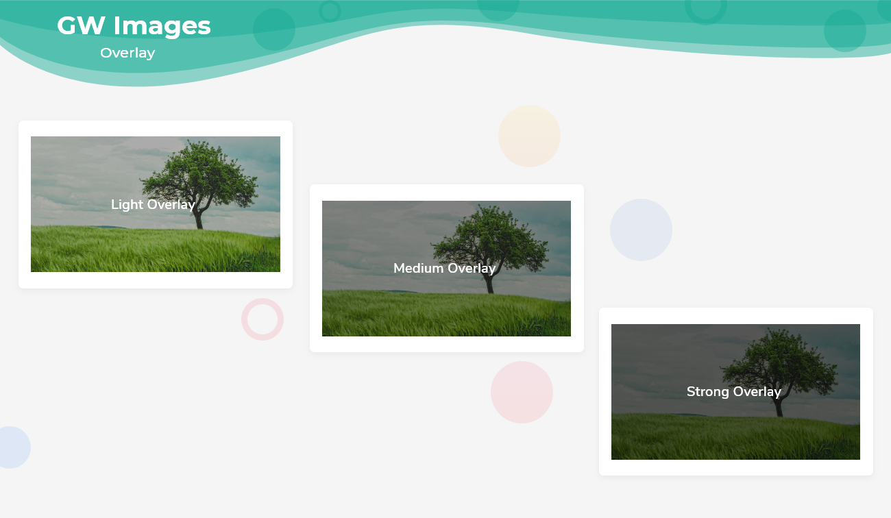
GF Flutter Cards with OverlayImage
GFCards has OverlayImage property wherein a background image can be placed and upon the image any widget like Text, buttons can be used as shown in the image below.
Below shows a simple example code for GFCard with Card OverlayImage:
import 'package:getwidget/getwidget.dart';

  GFCard(
            boxFit: BoxFit.cover,
            titlePosition: GFPosition.start,
            showOverlayImage: true,
            imageOverlay: AssetImage(
              'your asset image',
            ),
            title: GFListTile(
              avatar: GFAvatar(),
              titleText: 'Game Controllers',
              subTitleText: 'PlayStation 4',
            ),
            content: Text("Some quick example text to build on the card"),
            buttonBar: GFButtonBar(
              children: <Widget>[
                GFAvatar(
                  backgroundColor: GFColors.PRIMARY,
                  child: Icon(
                    Icons.share,
                    color: Colors.white,
                  ),
                ),

              ],
            ),
          ),
GFCard Custom Properties for Flutter Card:
GFCard can be used like GFCard with Avatar, GFCard with ImageOverlay, and just a GFCard. To make the GFcard more flexible with your Flutter card. we have the below custom properties:
| Name | Description |
|---|---|
| titlePosition | helps to set the title at top of the card |
| color | sets the background color of the card |
| elevation | controls the size of the shadow below the card |
| shape | the shape of the card |
| borderOnForeground | whether to paint the shape of the border in front of the child, defaults to true |
| clipBehaviour | defines the clipping of the child |
| margin | defines the card's outer container margin |
| padding | defines the card's outer container padding |
| semanticContainer | represents a single semantic container, if false a collection of semantic nodes |
| border | to draw a border above the card |
| borderRadius | represents the rounded corners of the card |
| colorFilter | applies to the image before painting it |
| boxFit | how the image should be inscribed into the box |
| imageOverlay | display images as background with shaded overlay |
FAQ
Q. How to create a card in flutter?
A card is a flutter widget that is a panel and has rounded corners with some light elevation to it. It is used to give a nice look and feel to the application. It is basically used to display any information with some action buttons and required messages on the screen.
Here, we will use the Getwidget library to make use of the GFCard that has many customisation options in them.
import 'package:getwidget/getwidget.dart';

GFCard(
 boxFit: BoxFit.cover,
 image: Image.asset('your asset image'),
 title: GFListTile(
   avatar: GFAvatar(
     backgroundImage: AssetImage('your asset image'),
   ),
   title: Text('Card Title'),
   subTitle: Text('Card Sub Title'),
),
content: Text("Some quick example text to build on the card"),
buttonBar: GFButtonBar(
 children: <Widget>[
   GFButton(
    onPressed: () {},
    text: 'Buy',
   ),
   GFButton(
    onPressed: () {},
    text: 'Cancel',
   ),
 ],
 ),
),
Q. How to make card clickable in flutter?
Card is a material widget in Flutter that is used to display any information that has a rounded corners and slight elevation to make the design elegant.
We have many clickable widgets in Flutter that is used to route or to make any further actions. We can make a card clickable by using those clickable widgets such as InkWell(), GestureDectector() etc.
We can see the example in the below code.
import 'package:getwidget/getwidget.dart';

GestureDetector(
 onTap: () => ......,
child: Card(...), );
Last Updated: September 21, 2023

