
GF Flutter CheckboxListTile
GF Flutter CheckBoxListTile
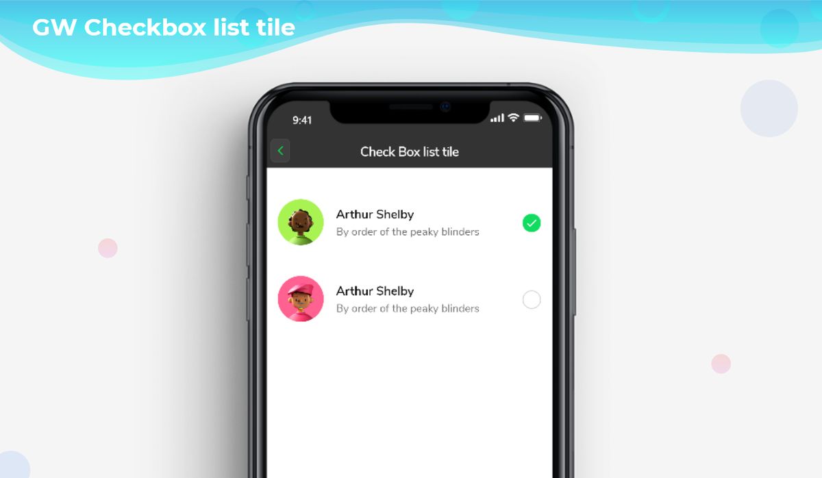
GFCheckBoxListTile is a Flutter CheckBoxList Tile that is a list of items wherein the user can check or uncheck the items in the list. It allows users to select one or more options inside the list. GFCheckBoxListTile can also be positioned right or left of the screen according to the need.
The example code with an avatar of Flutter CheckboxListTile or Flutter checkbox list example is as shown below.

bool isChecked = false;

GFCheckboxListTile(
  titleText: 'Arthur Shelby',
  subTitleText: 'By order of the peaky blinders',
  avatar: GFAvatar(
    backgroundImage: AssetImage('Assets image here'),
  ),
  size: 25,
  activeBgColor: Colors.green,
  type: GFCheckboxType.circle,
  activeIcon: Icon(
    Icons.check,
    size: 15,
    color: Colors.white,
  ),
  onChanged: (value) {
    setState(() {
      isChecked = value;
    });
  },
  value: isChecked,
  inactiveIcon: null,
),

GF Flutter CheckBoxListTile Custom Properties
The Look and feel of the GFCheckboxListTile can be customized using the GFCheckboxListTile properties.
| Name | Description |
|---|---|
| titleText | type of [String] used to pass text, alternative to title property and gets higher priority than the title |
| subTitleText | type of [String] used to pass text, alternative to subtitle property and gets higher priority than the subtitle |
| color | GFListTile's background color. Can be given [Color] or [GFColors] |
| avatar | type of [Widget] or [GFAvatar] used to create a rounded user profile |
| title | title to display inside the [GFListTile]. |
| subTitle | subtitle to display inside the [GFListTile]. |
| description | description to display inside the [GFListTile]. |
| position | allows the user to set the position of the checkbox to start or end |
| margin | defines the margin of GFListTile |
| padding | defines the padding of GFListTile |
| type | type of [GFCheckboxType] which is of four types is basic, square, circular, and custom |
| size | type of [double] which is GFSize ie, small, medium, and large and can use any double value |
| activeBgColor | type of [Color] used to change the backgroundColor of the active checkbox |
| inactiveBgColor | type of [Color] used to change the backgroundColor of the inactive checkbox |
| activeBorderColor | type of [Color] used to change the border color of the active checkbox |
| inactiveBorderColor | type of [Color] used to change the border color of the inactive checkbox |
| onChanged | Called when the user checks or unchecks the checkbox. |
| value | Used to set the current state of the checkbox |
| activeIcon | type of Widget used to change the checkbox's active icon |
| inactiveIcon | type of [Widget] used to change the checkbox's inactive icon |
| customBgColor | type of [Color] used to change the background color of the custom active checkbox only |
| selected | To have the list tile appear selected when the checkbox is checked, pass the same value to both. Normally, this property is left to its default value, false. |
| autofocus | on the true state, this widget will be selected as the initial focus when no other node in its scope is currently focused |
Last Updated: September 21, 2023

