
GF Flutter – DropDown Button Widget
In this article, we will learn how to use a Flutter DropDownButton and its various properties used in flutter. The dropdownbutton widget is used to display a a list of values in a dropdown fashion in any application. Now, let us see what a Dropdownbutton is.
In Flutter, A DropDownButton is a material design button. The DropDownButton is a widget that can be used to select one unique value from a set of values that will be shown in a list of dropdown fashion. It lets the user select one unique value from a number of items in the list. The currently selected value will be the default value in the list. The arrow icon on the right side shows that its a clickable action that opens the dropdown list.
GFDropdown is a Dropdown in Flutter Widget that lets users select from the number of items and display the selected item. It displays a list of items in the overlay dropdown fashion. It has an arrow button to show the dropdown list.
GF Flutter Dropdown List Usage
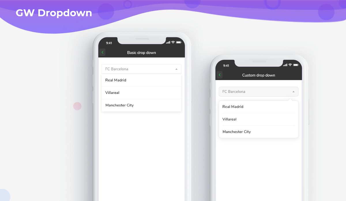
The simple example code of a basic GFDropdown is as shown below.
String dropdown;

Container(
  height: 50,
  width: MediaQuery.of(context).size.width,
  margin: EdgeInsets.all(20),
  child: DropdownButtonHideUnderline(
    child: GFDropdown(
      padding: const EdgeInsets.all(15),
      borderRadius: BorderRadius.circular(5),
      border: const BorderSide(
          color: Colors.black12, width: 1),
      dropdownButtonColor: Colors.white,
      value: dropdownValue,
      onChanged: (newValue) {
        setState(() {
          dropdownValue = newValue;
        });
      },
      items: [
        'FC Barcelona',
        'Real Madrid',
        'Villareal',
        'Manchester City'
      ]
          .map((value) => DropdownMenuItem(
        value: value,
        child: Text(value),
      ))
          .toList(),
    ),
  ),
),

GF Custom Flutter Dropdown Menu
GFDropdown features allow users to create a customized dropdown for the more flexible and interactive UI design.
Flutter Custom Dropdown Menu List Example Source code
String dropdown;

Container(
  height: 50,
  width: MediaQuery.of(context).size.width,
  margin: EdgeInsets.all(20),
  child: DropdownButtonHideUnderline(
    child: GFDropdown(
      padding: const EdgeInsets.all(15),
      borderRadius: BorderRadius.circular(10),
      border: const BorderSide(
          color: Colors.black12, width: 1),
      dropdownButtonColor: Colors.grey[300],
      value: dropdownValue,
      onChanged: (newValue) {
        setState(() {
          dropdownValue = newValue;
        });
      },
      items: [
        'FC Barcelona',
        'Real Madrid',
        'Villareal',
        'Manchester City'
      ]
          .map((value) => DropdownMenuItem(
        value: value,
        child: Text(value),
      ))
          .toList(),
    ),
  ),
),
GF Flutter Dropdown Menu Custom Properties
The look and feel of the GFDropdown can be customized using the GFDropdown properties.
| Name | Description |
|---|---|
| icon | The widget to use for the drop-down button's icon. Defaults to an [Icon] with the [Icons.arrow_drop_down] glyph. |
| elevation | The z-coordinate at which to place the menu when open. |
| value | The value of the currently selected [DropdownMenuItem]. |
| border | Defines the border of dropdown button |
| padding | Defines the padding given inside the dropdown |
| hint | A placeholder widget that is displayed by the dropdown button. |
| disabledHint | A message to show when the dropdown is disabled. |
| onChanged | <p>Called when the user selects an item.</p><p>If the [onChanged] callback is null or the list of [DropdownButton.items] is null then the dropdown button will be disabled,</p> |
| onTap | Called when the dropdown button is tapped. |
| style | Defaults to the [TextTheme.subtitle1] value of the current [ThemeData.textTheme] of the current [Theme]. |
| underline | The widget to use for drawing the drop-down button's underline. |
| iconDisabledColor | The color of any [Icon] descendant of [icon] if this button is disabled, i.e. if [onChanged] is null. |
| iconEnabledColor | The color of any [Icon] descendant of [icon] if this button is enabled, i.e. if [onChanged] is defined. |
| iconSize | The size to use for the drop-down button's down arrow icon button. |
| isDense | Reduce the button's height. |
| isExpanded | Set the dropdown's inner contents to horizontally fill its parent. |
| itemHeight | defines the height of the menu items |
| focusColor | The color for the button's [Material] when it has the input focus. |
| dropdownColor | Defines the background color of the dropdown. |
| borderRadius | Defines the border radius of the dropdown. |
| dropdownButtonColor | Defines the background color of the dropdownButton. |
| autofocus | <p>On true state it should focus itself if nothing else is already focused.</p><p>Defaults to false</p> |
| focusNode | Defines the keyboard focus for this widget. |
Last Updated: September 21, 2023

