How to Add Images in the Flutter App

Flutter Images are those that manage the asset images and show that upon run time. The images can be static images or dynamic images.
GFImage supports and manages the images to be displayed on run time. It has the following types of images which can be used in any application.
GF Flutter Asset Image
Asset image is used to display the images stored locally in the assets folder. Below is a simple example code of an asset image.
import 'package:getwidget/getwidget.dart';

GFImageOverlay(
  height: 200,
  width: 300,
  image: AssetImage('your asset image')
)

GF Flutter Network Image
Network image is used to display an image from the internet. Hence the passing parameter for the image will be as shown in the below code.
import 'package:getwidget/getwidget.dart';

GFImageOverlay(
  height: 200,
  width: 300,
  image: NetworkImage('your network image')
)

GF Flutter Image Overlay
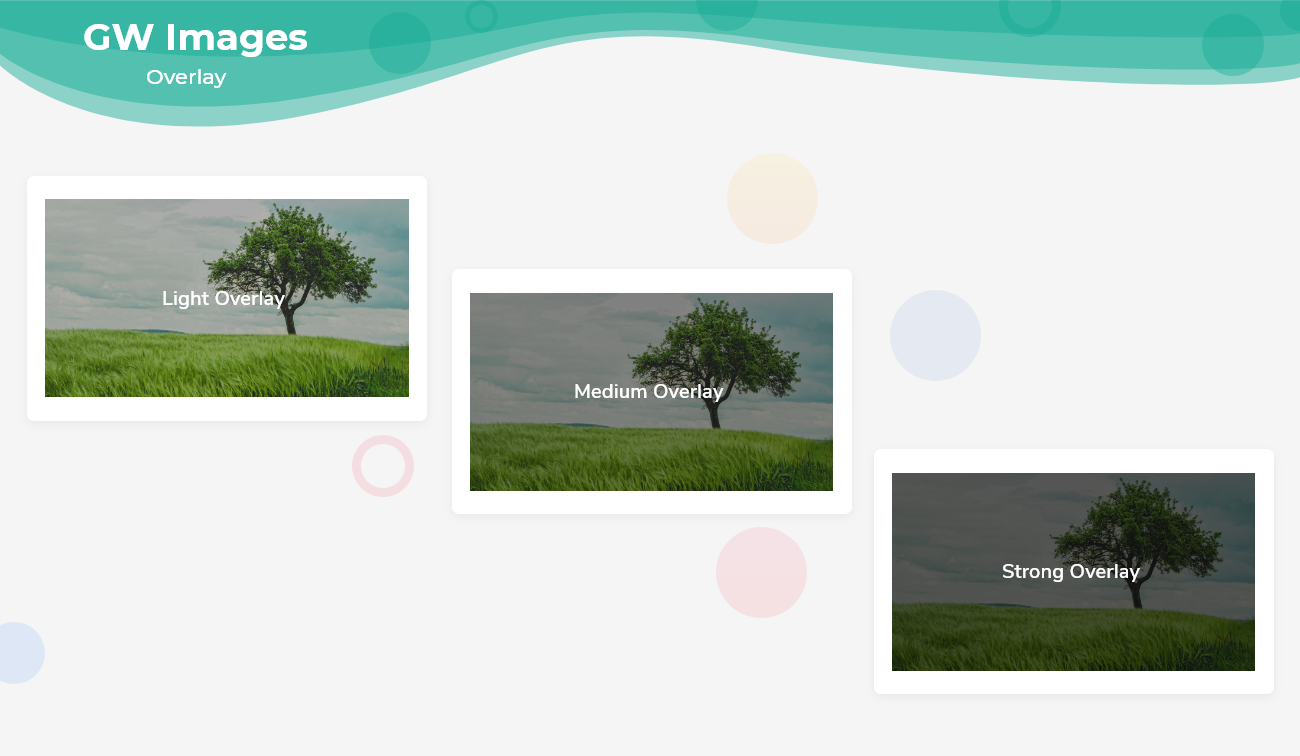
Image Overlay is used to set the image in the background and text in the foreground with the colorFilter property that takes two colors, and outputs one color
Flutter Image overlay example Code
import 'package:getwidget/getwidget.dart';

GFImageOverlay(
  height: 200,
  width: 300,
  child: Center(
    child: Text('Light Overlay', style:TextStyle(color: GFColors.LIGHT)),
  ),
  image: AssetImage('your asset image'),
  colorFilter: new ColorFilter.mode(Colors.black.withOpacity(0.3),
   BlendMode.darken),
),

GF Flutter Circle Image
A Circular Image is an image with a circle-shaped border. It is widely used in any profile screen to display the profile picture.
Flutter Circle image example Code
import 'package:getwidget/getwidget.dart';

 GFImageOverlay(
   height: 200,
   width: 200,
   shape: BoxShape.circle,
   image:AssetImage('your asset image'),
   boxFit: BoxFit.cover,
 )

GF Flutter Image Custom Properties
The custom properties of GFImage are given below to customize the look and feel of the image.
| Name | Description |
|---|---|
| height | defines the height of the image |
| width | defines the width of the image |
| color | defines the background color of the image |
| margin | image's outer container margin |
| padding | image's outer container padding |
| alignment | to align the child within the image |
| boxFit | how to image should be inscribed into the box |
| borderRadius | the corners of the image |
| border | the border above the image |
Last Updated: September 27, 2023


