GF Flutter Loader

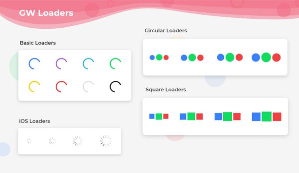
GFLoader is a Flutter Loader circular indicator that will be loading continuously that indicates something is about to load.
GF Flutter Loader and its Usage:
GFLoader is a Flutter circular spinner that spins over time which signifies that some part of the program is about to get executed.
The basic code of a simple GFLoader is as shown below. There are five types in which the default corresponds to the android type of loader.
import 'package:getwidget/getwidget.dart';
 GFLoader(),

GF Flutter Loaders Custom Type
There are five different types of loaders namely android, ios, circle, square, and custom
Flutter IOS Spinner
A simple ios loader in which the type of the loader should be passed to ios. The code is as shown below.
import 'package:getwidget/getwidget.dart';
 GFLoader(
   type:GFLoaderType.ios
 ),

Flutter Circular Loader
A simple circular shape loader in which the type of the loader should be passed to circle. The code is as shown below.
import 'package:getwidget/getwidget.dart';

 GFLoader(
   type:GFLoaderType.circle
 ),

Flutter Square Loader/Spinner
A simple square shape loader in which the type of the loader should be passed to square. The code is as shown below.
import 'package:getwidget/getwidget.dart';

 GFLoader(
   type:GFLoaderType.square
 ),

Gf Flutter Custom Loader
Apart from the four types described above, there is a custom loader in which we can pass text, icons, images, etc as the parameters to show a variety of customized loaders. The below code shows the custom loader with a gif in it.
import 'package:getwidget/getwidget.dart';

 GFLoader(
   type: GFLoaderType.custom,
   child: Image(image: AssetImage(your gif here...),
),

Flutter Custom Loader with Icon
The below example code shows Flutter custom loaders with icons in them.
import 'package:getwidget/getwidget.dart';

GFLoader(
  type: GFLoaderType.custom,
  loaderIconOne   : Icon(Icons.insert_emoticon),
  loaderIconTwo   : Icon(Icons.insert_emoticon),
  loaderIconThree : Icon(Icons.insert_emoticon),
),

Flutter Custom Loader with text
We can also pass text as a parameter to the custom loader. The below code shows a simple usage.
import 'package:getwidget/getwidget.dart';

GFLoader(
  type: GFLoaderType.custom,
  loaderIconOne   : Text('Please'),
  loaderIconTwo   : Text('Wait'),
  loaderIconThree : Text('a moment'),
),

GFLoader Custom Properties:
The look and feel of GFLoader can be customized using the below properties.
| Name | Description |
|---|---|
| child | child of type [Widget] used only for custom type and is prominent over loaderIconOne, loaderIconTwo and loaderIconThree in custom type |
| duration | defines the animation duration of the loader only in circle and square type |
| loaderColorOne | defines the color of the first dot in only circle or square type of loader |
| loaderColorTwo | defines the color of the second dot in only circle or square type of loader |
| loaderColorThree | defines the color of the third dot in only circle or square type of loader |
| androidLoaderColor | defines the color of the android type loader only |
| loaderstrokeWidth | defines the stroke width of the android type loader only |
| size | defines the size of the loader ie, small, medium and large and it is applicable to android ios, circle and square type loaders |
Last Updated: September 26, 2023
