
GF Flutter Progress Bar
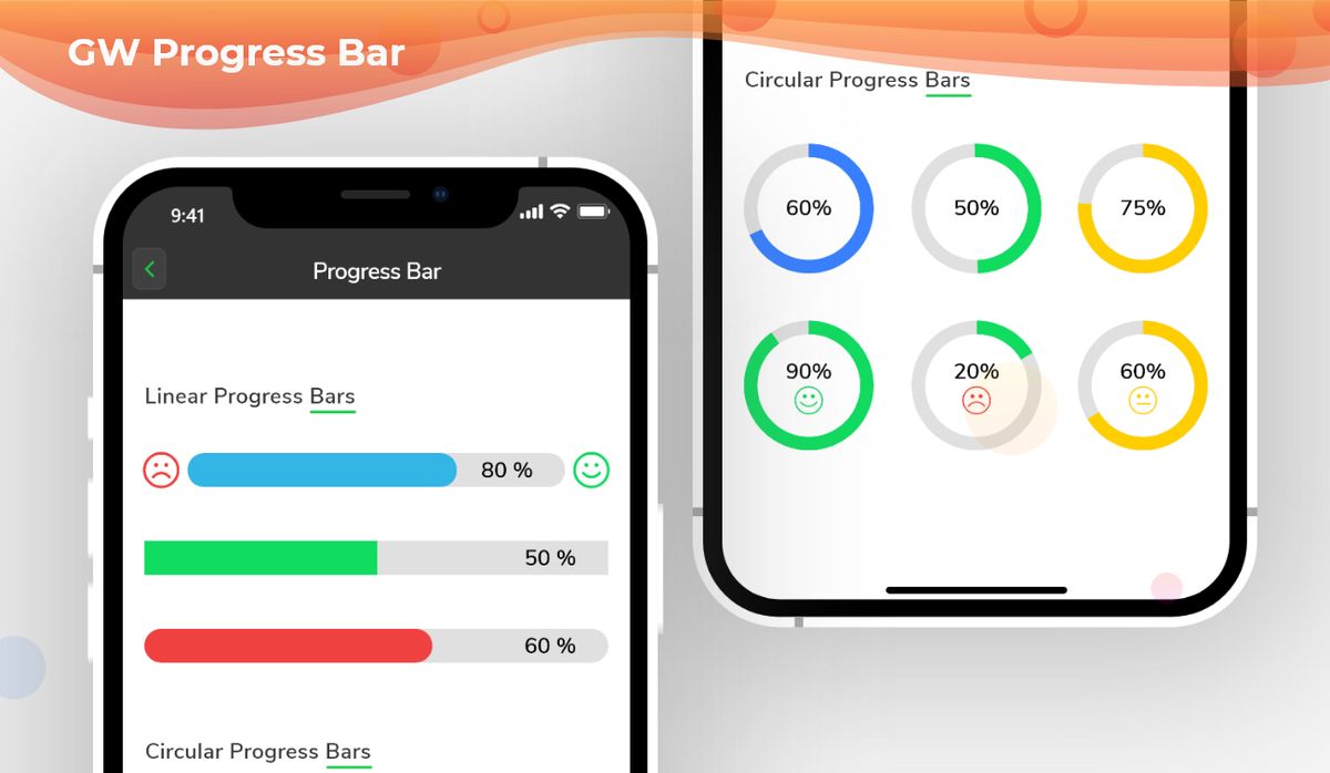
GFProgress Bar is a Flutter Progress bar or a Flutter Progress Button that tells the percentage of progress done in any given task or work.
GFProgress bar can be of two types, a simple linear progress bar or a Circular Progress bar.
Flutter Linear Progress Bar Indicator
A Linear Progress Bar is a progress bar that has a straight line of progress percentage shown on them. The below code shows a simple Linear progress bar with some defined properties of the progress bar.

Flutter Line Progress Bar indicator example code
 import 'package:getwidget/getwidget.dart';

 GFProgressBar(
     percentage: 0.9,
     backgroundColor : Colors.black26,
     progressBarColor: GFColors.DANGER
)

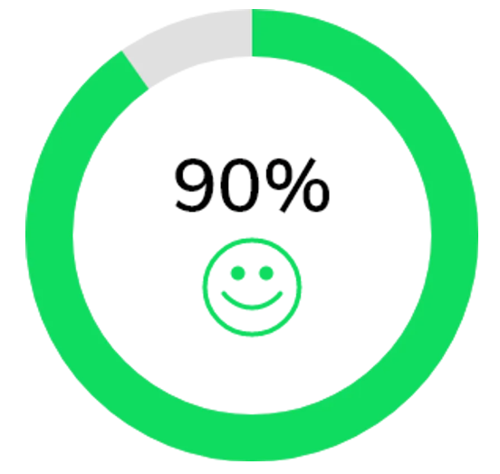
Flutter Circle Progress Bar Indicator
The Circular progress bar is as same as the linear progress bar with some additional properties added to the code structure. The Circle Progress Bar will be basically a circle in shape and the percentage will be shown inside the circle as shown in the below image. The below code shows a simple circular progress bar.

Flutter Circle Progress Bar Indicator example code
import 'package:getwidget/getwidget.dart';

 GFProgressBar(
     percentage: 0.9,
     width:100,
     radius: 90,
     type: GFProgressType.circular,
     backgroundColor : Colors.black26,
     progressBarColor: GFColors.DANGER
)
Flutter Progress bar with Child property
The progress bar can be customized to show the percentage of progress completed. To show the progress percentage we can use child property which is a Widget type and can be a text, icon, image, etc. The below code shows how a child's property can be used as text to show the progress percentage.
Flutter Custom Progress Bar Indicator with child example code
import 'package:getwidget/getwidget.dart';

GFProgressBar(
    percentage: 0.5,
    lineHeight: 20,
    child: const Padding(
        padding: EdgeInsets.only(right: 5),
        child: Text('50%', textAlign: TextAlign.end,
                    style: TextStyle(fontSize: 16, color: Colors.white),
               ),
        ),
     backgroundColor: Colors.black26,
     progressBarColor: GFColors.WARNING,
)
Flutter Progress bar with leading and trailing icons
The progress bar can be used with leading and trailing icons to show the level of progress percent from 0 to 1. The below code shows leading and trailing icons in a Linear Progress bar.
import 'package:getwidget/getwidget.dart';

GFProgressBar(
     percentage: 0.8,
     lineHeight: 20,
     alignment: MainAxisAlignment.spaceBetween,
     child: const Text('80%', textAlign: TextAlign.end,
                  style: TextStyle(fontSize: 16, color: Colors.white),
                  ),
     leading  : Icon( Icons.sentiment_dissatisfied, color: GFColors.DANGER),
     trailing: Icon( Icons.sentiment_satisfied, color: GFColors.SUCCESS),
     backgroundColor: Colors.black26,
     progressBarColor: GFColors.INFO,
)
GF FLutter Progress Bar Custom Properties
The Look and feel of GFProgressBar can be customised using the following properties:
| Name | Description |
|---|---|
| percentage | type of double which should be from 0 to 1 to indicate the progress percentage |
| radius | type of double used to show the radius of the Circular Progress Bar |
| width | defines the width of the progress bar |
| type | type of [GFProgressType] which changes the shape of progress bar ie , linear or circular |
| lineHeight | defines the height of the progress bar |
| circleWidth | defines the thickness of the circle's arc in Circular Progress bar |
| circleStartAngle | defines the angle on which the circle starts to progress in degrees.(ie 0.0, 45.0, 90.0 etc) |
| animation | type of bool which allows the progress line to animate when the percentage value is changed, default is false |
| animationDuration | duration of animation in milliseconds , applicable only if animation is true |
| alignment | used to align the leading and trailing widget which the progress bar evenly |
| padding | defines the padding of the progress bar |
| animateFromLastPercentage | type of bool which is used to animate the progress bar from the last percentage value set |
| linearGradient | linear gardient colors given to the progress line color |
| autoLive | set to false if you don't want to preserve the state of the widget , default is true |
| fromRightToLeft | set to true if you want to animate the linear progress bar from right to left |
| mask | Creates a mask filter that takes the progress shape being drawn and blurs it |
| clipLinearGradient | set to true if you want to display only a part of [linearGradient] based on percentage value, |
| progressHeadType | type of [GFProgressHeadType] which changes the shape of the progress head ie , circular or sqaure |
| reverse | type to bool which is used to display the progress in reverse direction |
Last Updated: September 27, 2023

