
GF Flutter Rating

GF Flutter Rating Bar
Flutter rating allows the user to start rating any of the products using the start icons as rating icons.
GF Flutter Rating Star and its Usage
GF Flutter Star Rating is a very simple widget that permits the users to rate with the help of star icons. Users can touch the icons to start rating.
The simple code of a basic GF Start Rating is as shown below.
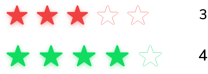
double _rating = 3;

GFRating(
  value: _rating,
  onChanged: (value) {
    setState(() {
      _rating = value;
    });
  },
),

GF Flutter Rating with TextField
If showTextForm true, it displays the GF Rating bar with a text field, that takes user input to show the rating.
The simple example code of the rating bar with textform is shown below.
final _ratingController = TextEditingController();
double _userRating = 4.5;

@override
void initState() {
  super.initState();
  _ratingController.text = '4.5';
}

GFRating(
  value: _userRating,
  showTextForm: true,
  controller: _ratingController,
  suffixIcon: GFButton(
    type: GFButtonType.transparent,
    onPressed: () {
      setState(() {
        _userRating = double.parse(_ratingController.text ?? '0.0');
      });
    },
    child: const Text('Rate'),
  ),
),
GF Flutter Rating Bar Custom Properties:
The look and feel of the GF Rating can be customized using the GF Rating properties.
| Name | Description |
|---|---|
| itemCount | defines the total number of rating items |
| color | defines the color of items |
| borderColor | defines the border color of [halfFilledIcon] |
| size | defines the size of items. GFSize can be used for size variations like small. medium. large |
| allowHalfRating | if true, allow half rating of items. Default it will be in a true state |
| filledIcon | defines the items when filled |
| halfFilledIcon | defines the items when half-filled |
| defaultIcon | defines the default items, when having filledIcon and halfFilledIcon |
| spacing | defines the space between items |
| value | defines the rating value |
| onChanged | return current rating whenever rating is updated |
| showTextForm | if true, shows rating [TextFormField] with the rating bar, that allows the user input to show rating |
| suffixIcon | defines the design and function of rating [TextFormField]'s suffix icon |
| controller | controls the [TextField] Controller of rating [TextFormField] |
| inputDecorations | defines the [InputDecoration] of rating [TextFormField] |
| margin | defines the margin of rating [TextFormField] |
| padding | defines the padding of rating [TextFormField] |
Last Updated: September 21, 2023

