
GF Shimmer

GF Flutter Shimmer and its Usage:
GFShimmer is a Flutter Shimmer Effect Widget that can be used by giving Linear Gradient for more visual shimmer effect or just by adding Main Color and Secondary Color for basic shimmer effect.
How to Use Flutter Shimmer Effect using GetFlutter
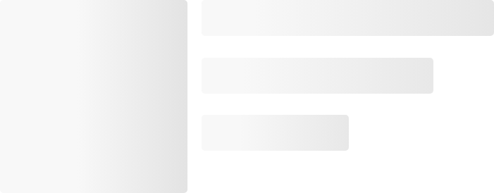
The below code gives a simple Flutter Shimmer effect for children with the main color and secondary color.
import 'package:getwidget/getwidget.dart';

GFShimmer(
  child: emptyBlock,
),

final Widget emptyBlock = Padding(
      padding: const EdgeInsets.symmetric(horizontal: 16),
      child: Row(
        crossAxisAlignment: CrossAxisAlignment.start,
        children: [
          Container(
            width: 54,
            height: 46,
            color: Colors.white,
          ),
          const SizedBox(width: 12),
          Expanded(
            child: Column(
              crossAxisAlignment: CrossAxisAlignment.start,
              children: <Widget>[
                Container(
                  width: double.infinity,
                  height: 8,
                  color: Colors.white,
                ),
                const SizedBox(height: 6),
                Container(
                  width: MediaQuery.of(context).size.width * 0.5,
                  height: 8,
                  color: Colors.white,
                ),
                const SizedBox(height: 6),
                Container(
                  width: MediaQuery.of(context).size.width * 0.25,
                  height: 8,
                  color: Colors.white,
                ),
              ],
            ),
          )
        ],
      ),
    );

GF Flutter Shimmer with Gradient

The below code gives a Shimmer effect for children with Linear Gradient. It only takes Liner Gradient when [showGradient] is true.
GFShimmer(
  child: const Text(
    'GF Shimmer',
    style: TextStyle(fontSize: 48, fontWeight: FontWeight.w700),
  ),
  showGradient: true,
  gradient: LinearGradient(
    begin: Alignment.bottomRight,
    end: Alignment.centerLeft,
    stops: const <double>[0, 0.3, 0.6, 0.9, 1],
    colors: [
     Colors.teal.withOpacity(0.1),
     Colors.teal.withOpacity(0.3),
     Colors.teal.withOpacity(0.5),
     Colors.teal.withOpacity(0.7),
     Colors.teal.withOpacity(0.9),
    ],
  ),
),
GF Flutter Shimmer Custom Properties:
The look and feel of GFShimmer can be customized using the below properties:
| Name | Description |
|---|---|
| child | The child of type [Widget] to display shimmer effect. |
| duration | Controls the speed of the shimmer effect. The default value is 1500 milliseconds. |
| direction | Controls the direction of the shimmer effect. The default direction is GFShimmerDirection.leftToRight. |
| gradient | Controls the [child]'s shades of color using Linear gradient. Child [Widget] only takes gradient color, If [showGradient] is true. |
| showShimmerEffect | Controls animation effect, defaults true state that makes animation active. |
| showGradient | If true, takes gradient color [gradient] for the [child]'s shimmer effect. Default set to false. |
| shimmerEffectCount | Controls the animation shimmerEffectCount. The default value is '0', that displays child [Widget]'s shimmer effect forever. |
| mainColor | Defines the main color of the [child]'s shimmer effect. Child [Widget] takes the main color, only if [showGradient] is false. Default [showGradient] will be false. |
| secondaryColor | Defines the secondary color of the [child]'s shimmer effect. Child [Widget] takes secondary color, only if [showGradient] is false. Default [showGradient] will be false. |
Last Updated: September 21, 2023

